Most trend articles have the same problem: they list things that look interesting without telling you whether any of them apply to your business. A dental practice does not need tactile brutalism.
So this covers what’s actually happening in 2026, plus the more useful part — which of these are worth adopting, which are for a specific kind of brand only, and which will look dated fastest.
One framing worth holding throughout, from a designer writing about this year: design is no longer about adding visual flair because it looks good — every choice needs a reason. Trends are tools in a toolbox, and you don’t need every tool.[1]
The context: everything looks the same now
There’s a reason 2026’s trends are pulling in the direction they are, and it’s worth understanding before the list.
The integration of generative AI has created a wave of homogenization — as vibe-coded templates flood the market, the visual baseline has flatlined. To stand out, brands and agencies are executing a sharp aesthetic pivot.[2]
That’s the engine behind most of what follows. When it becomes trivial to produce a competent, generic website, competence stops being a differentiator, and design moves toward whatever proves a human made deliberate choices. Related: website templates and creative without chaotic.
1. Typography as the entire design
The strongest trend of the year, and the most broadly useful.
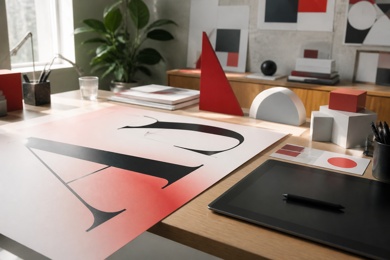
Typography has moved from a supporting element to the primary interface architecture — driven by both editorial boldness and an engineering mandate to reduce page weight. Brands use viewport-scaled fonts so a single word stretches edge to edge, making text the focal point and removing stock imagery entirely.[2]
Custom fonts, oversized headlines, motion, and layered styles are being used to make bold first impressions, with expressive type appearing everywhere from landing pages to navigation.[3]
Should you adopt it? Yes, in moderation, and it’s the rare trend that’s also a performance improvement — replacing a hero image with large type removes a heavy asset. The restrained version (confident type, generous spacing, a strong serif for headings) works for almost any business. Wide lettering, generous spacing, and bold headline styles make a site feel confident and authoritative while remaining approachable.[4]
2. Tactile brutalism
The year’s signature high-end aesthetic.
For the first half of the 2020s, “corporate soft UI” reigned — drop shadows and soft rounded corners. In 2026, premium experiences pivoted to tactile brutalism: sharp geometry, stark contrasts, single-pixel borders. Instead of faked depth, designers use mathematically generated CSS textures like film grain or CRT scanlines to mimic raw industrial materials.[5]
The purpose is explicitly to prove human authorship[2] — a direct response to the homogenization problem above.
Should you adopt it? Only if your audience is design-literate and your category is visually crowded. It reads as deliberate and confident to designers and as broken to a lot of mainstream audiences. For a law firm, a medical practice, or anything trust-sensitive, this is actively wrong.
3. Organic and anti-grid layouts
Pulling in the opposite direction from brutalism, and both are happening simultaneously.
After years of strict grids and sharp minimalism, design is softening. Organic shapes, flowing lines, and soft gradients make experiences feel more natural. Anti-grid layouts challenge the rigid uniformity of the past decade, introducing rhythm and playfulness — reflecting a broader desire for humanity in technology.[6]
Should you adopt it? Selectively. The soft, human end of this is widely applicable and low-risk. Full anti-grid layouts are harder than they look — irregular layouts that still feel intentional rather than accidental require real skill, and they’re difficult to keep coherent as content grows.
4. Color: loud again
Bright, saturated palettes are making a comeback, fueled by Y2K nostalgia, retro patterns, and “dopamine design.” Neon gradients, high-contrast pairings, and playful hues are replacing minimal or muted tones, especially for lifestyle, beauty, and youth-focused brands.[3]
Simultaneously, the opposite: a “nature distilled” aesthetic with muted, earthy tones of skin, wood, and soil — subtle sophistication that still brings warmth.[7]
Should you adopt it? Pick the one that matches your audience, not the one you find more interesting. The note in the source is the useful part — dopamine color is working specifically for lifestyle, beauty, and youth brands. Outside those categories it can read as trying too hard.
5. Maximalism and nostalgia
The resurgence of ’80s and early ’90s excess continues as part of a broader maximalism trend, often featuring grainy background textures, soft single-color gradients, and heavy use of vintage photography and styling. Drawn partly from the revival of print magazines as collectible objects, it creates a luxurious, timeless appeal.[7]
Should you adopt it? Category-dependent, and this is one to be careful with — nostalgia trends date fastest, because they’re tied to a specific moment’s taste for a specific past. Strong for lifestyle and consumer brands with personality; weak for anything where dated-in-two-years is expensive.
6. 3D, WebGL, and immersive product views
Designers are leaning into depth and interaction, moving beyond static images to immersive 3D-driven experiences using WebGL — interactive models, scroll-triggered animation, AR previews. Brands like Nike and IKEA use 3D and AR to let users try products virtually or visualize fit before purchase.[3]
Should you adopt it? Only where it does a job. A 3D product viewer for something people need to see from all angles is genuine utility. A WebGL scene on a services homepage is expensive decoration that costs load time. This is the trend with the widest gap between “impressive” and “useful.” Check that trade with a website speed test before committing.
7. AI-driven personalization
AI has moved from behind the scenes into the user experience — homepage messaging that adapts to visitor type, or calls-to-action that change based on behavior.[1]
Should you adopt it? Probably not yet, for most businesses, and the source is refreshingly honest about this: it’s more complex to implement than the other trends, requiring advanced tools or custom development. For most photographers, designers, and coaches, focusing on clarity and accessibility gives better ROI.[1]
That’s the right read. Personalization pays off at scale, with real traffic and real data. Below that threshold it’s engineering effort spent on a rounding error.
8. Performance as a design constraint
The least visible trend and arguably the most important.
Beneath the surface, frontend engineering is optimizing for lightweight delivery — stripping away heavy JavaScript in favor of lightweight CSS logic.[2] Building lean layouts and avoiding plugin overload to keep sites fast is now part of the design brief, not just an engineering afterthought.[6]
Note how this interacts with the visual trends above: typography-led design is fast, WebGL-heavy design is not. In 2026 the performance cost of an aesthetic is part of choosing it. See also performance optimization.
Should you adopt it? This one isn’t optional. It’s the constraint every other choice on this list operates within.
9. Accessibility as a baseline
Accessibility-first design is among the shifts defining 2026[6], and the framing has moved from compliance to craft.
Worth pairing with an observation about what actually loses trust: websites fail when they feel confusing, outdated, or quietly untrustworthy — the site isn’t obviously broken, but it sends subtle signals that make users hesitate without realizing why.[4]
Should you adopt it? Yes, unconditionally. It’s also the trend with the clearest business case — poor contrast, tiny tap targets, and unclear focus states cost you customers who never mention why they left. That’s UI/UX territory as much as visual design.
What this actually means for your site
Most businesses should take three things from this list and ignore the rest:
Take: confident typography. Widely applicable, improves performance, signals care. The single best return on this list.
Take: performance discipline. Non-negotiable, and it constrains everything else.
Take: accessibility. Not a trend so much as a standard that’s finally being treated as one.
Consider, if your category fits: organic softness, dopamine color, nostalgia — all strong for consumer and lifestyle brands, wrong for trust-sensitive services.
Probably skip: tactile brutalism unless your audience is design-literate, WebGL unless it does a specific job, AI personalization unless you have the traffic to justify it.
A test worth using before adopting anything: does it serve the visitor, does it fit the brand, and can you maintain it? If not all three, skip it.[1]
For concrete examples worth studying (with the same caution about copying aesthetics blindly), see best website designs 2026.
The one that ages worst
Worth naming, because trend articles rarely do.
Nostalgia and maximalism date fastest. They’re tied to a specific moment’s appetite for a specific past, and when that appetite shifts, the design doesn’t age gracefully — it looks like 2026 specifically.
Confident typography, generous whitespace, clear hierarchy, and fast loading have looked good for decades and will continue to. If you’re not planning another redesign for four or five years, weight your choices accordingly. When a refresh is due, website redesign is the structured path.
The short version
- AI-driven homogenization is the engine behind 2026’s trends — deliberate human choice is now the differentiator
- Typography as primary design is the strongest and most broadly useful trend, and it improves performance
- Tactile brutalism is the year’s signature high-end look and wrong for most trust-sensitive businesses
- Color split in two directions: dopamine brights for lifestyle brands, muted earth tones for warmth
- 3D and WebGL earn their weight in product visualization and rarely elsewhere
- AI personalization needs scale to pay off — clarity and accessibility give better returns below that
- Performance and accessibility aren’t trends, they’re the constraints everything else works within
- Nostalgia and maximalism date fastest; typography and whitespace don’t date at all
Sources
- Showit — 2026 web design trends you need to know
- Fireart Studio — Web design trends 2026: tactile brutalism & invisible architecture
- Figma — Top web design trends for 2026
- Northwoods — Website design trends for 2026
- Enter — Top web design trends dominating 2026
- Elementor — Web design trends to expect in 2026
- Wix — The 11 biggest web design trends of 2026
- VistaPrint — 8 web design trends 2026
Compiled August 2026. Trend articles date faster than any other content type — worth refreshing annually.
Want a redesign that picks the right tools from this list — and skips the ones that won’t age? Start with web design or website redesign.
Plenox Studio
Design notes from Plenox Studio on craft, conversion, and redesigns that hold up after launch.