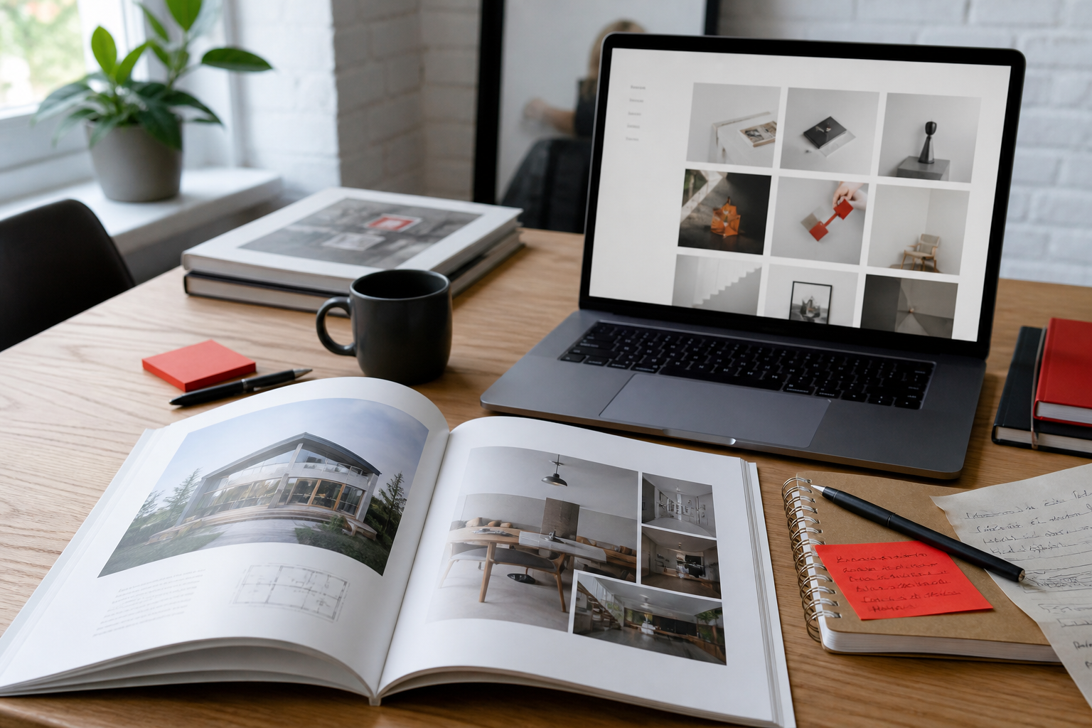
There’s a specific kind of agency website that’s exhausting to visit. Something moves the moment you land. The cursor has been replaced with a shape that lags behind your actual pointer. Scrolling triggers an animation that hijacks the page and won’t let you skip it. Somewhere in there is presumably a list of services, but finding it feels like a puzzle you didn’t agree to solve.
The intent behind that site is obvious — we’re creative, look how creative we are. The effect is the opposite. It reads as an agency more interested in performing creativity than in solving anything.
Meanwhile, the genuinely impressive portfolios are often much quieter. That gap — between a site that feels creative and one that feels chaotic — comes down to a set of choices that are more identifiable than “good taste.”
This matters in both directions. If you’re hiring a creative agency, this is how you read their site as evidence of how they’ll treat your project. If you’re building your own portfolio, it’s the line you’re trying to stay on the right side of.
The line: creativity is what’s left after subtraction
Chaotic design adds. Creative design chooses.
That’s the whole distinction, and almost everything below is an application of it. A chaotic portfolio has an unusual cursor and a scroll-jacked intro and a custom loader and text that scrambles on hover and a WebGL background. Any one of those, executed well and used purposefully, could be the thing that makes the site memorable. All of them together cancel each other out — nothing stands out because everything is trying to.
The uncomfortable part for designers: chaos usually comes from not deciding. Every idea that survived to the live site is an idea nobody was willing to cut. What looks like maximalist confidence is often indecision wearing a costume.
Creative restraint means having ten ideas and shipping two.
Six signals that separate the two
1. There’s one bold move, not five
Strong portfolios pick a single defining characteristic — an unusual grid, dramatic typography, one striking interaction — and let everything else stay quiet in support of it.
Creative: typography set enormous and doing all the visual work, with plain layout and no imagery competing. Chaotic: enormous typography, plus a video background, plus animated transitions, plus a custom cursor.
If you can’t name the one thing a site is doing in a single sentence, that’s usually the diagnosis.
2. Navigation is still navigation
Reinventing the menu is the most common place creativity tips into hostility. There’s genuinely interesting work to be done here — but a visitor should never have to work out how to reach your case studies.
Creative: navigation that’s structurally conventional but visually distinctive. Chaotic: navigation hidden behind an unlabeled icon, or requiring a discovery moment before it’s usable.
An agency that makes its own site hard to navigate is telling you something about how it prioritizes, and prospective clients read that correctly.
3. The work is visible fast
Portfolio sites exist for one reason: showing work. Anything between the visitor and the work needs to justify itself.
Creative: a strong opening statement, with work visible within a screen or two of scrolling. Chaotic: a loading animation, then an intro sequence, then a manifesto, then finally — several interactions later — the first project.
The elaborate preamble is usually the site working hardest to feel impressive at exactly the moment it’s testing patience. Visitors who came to evaluate whether you can do the job are being asked to sit through a performance first.
4. Motion has a job
Animation should direct attention, indicate state, or smooth a transition. When it exists purely to prove the site can animate, it registers as noise.
Creative: motion at two or three deliberate moments, everything else still. Chaotic: continuous ambient movement, multiple elements animating on load, effects that fire on every hover.
A useful test: can you point at each animation and say what it’s for? If the answer is “it looks cool,” it’s decoration — which isn’t automatically wrong, but it costs attention, and attention is finite.
5. It works on a phone
A depressing number of “creative” agency sites are essentially desktop-only experiences with a stripped, apologetic mobile version — or worse, a broken one.
This one is close to a hard rule, and it’s the fastest way to judge an agency you’re considering: open the site on your phone. A studio that treats mobile as an afterthought on its own site will do the same on yours, regardless of what the pitch says.
6. Case studies say what actually happened
The most reliable signal of all, and the one that separates a design studio from a decorator.
Creative: case studies explaining the client’s problem, the reasoning behind the approach, and what resulted. Chaotic: a grid of attractive screenshots with a client name and nothing else.
Beautiful screenshots prove someone can make things look good. They don’t prove anyone understood a business problem. Agencies that can’t articulate their reasoning usually didn’t have much, and if you’re hiring, this is the section to read most carefully — the same skill that shows up in a proper UX audit.
Where it goes wrong: three patterns
Creativity as compensation. Heavy visual effects covering thin work. If a site is dazzling and the case studies are three sentences each, the ratio is telling you something.
Trend accumulation. Every trend of the past two years, layered. Brutalist type, plus a bento grid, plus a noise texture, plus scroll-triggered reveals — a site can be entirely current and completely incoherent, because trends were designed to be alternatives, not ingredients.
The portfolio that ignores its own audience. Creative directors and business owners visit agency sites with a specific job: assess capability, understand the offer, decide whether to make contact. A site optimized to impress other designers frequently fails all three, and other designers aren’t the ones with budget.
But restraint isn’t the same as boring
The correction shouldn’t overshoot. There’s an equally common failure at the other end: agency sites so restrained they’re indistinguishable from a template. Same centered hero, same three feature cards, same soft gradient, same abstract 3D shape that could belong to any company in any industry.
That’s not restraint — it’s absence of decision-making, same as chaos, just quieter. For a business selling design judgment, a site with no point of view is arguably the worse failure, because it provides no evidence of anything. (If you’re stuck choosing between a template look and a distinctive build, see our take on website templates.)
The goal is a distinct point of view, expressed economically. One clear idea, committed to fully, with everything else deliberately quiet so that idea has room to land.
A practical test
Ask three questions about any portfolio — your own or one you’re evaluating:
- Can I describe the site’s defining idea in one sentence? If not, there probably isn’t one, or there are too many.
- Did I reach real work within two scrolls? If not, the site is prioritizing performance over evidence.
- Does every effect have a reason I could name? If several don’t, they’re accumulation rather than choice.
Failing one of these is normal. Failing all three is the definition of chaotic.
If you’re hiring rather than building
The agency’s own site is the only sample of their work where they were the client — no budget constraints imposed by someone else, no compromises forced by a stakeholder. It’s the purest available signal of their judgment.
So read it as evidence, not decoration:
- Their site is hard to use → they prioritize impression over function, and will likely bring that to your project
- Their case studies have no reasoning → they may be executing briefs rather than solving problems
- Their site is beautiful and their case studies show real results → strong signal
- Their site is generic → possibly fine at execution, but they haven’t demonstrated a point of view
- Their site breaks on mobile → walk away, whatever else looks good
None of these is conclusive alone. Together, they tell you more than a sales call will. If you want a structured read of your own site before you hire or redesign, start with a website audit.
The short version
- Creative design chooses; chaotic design accumulates — the difference is subtraction
- One bold move, executed fully, beats five competing for attention
- Navigation should be visually distinctive but structurally familiar
- Work should be visible within a screen or two; elaborate preambles cost patience
- Every animation should have a nameable purpose beyond looking impressive
- Case studies with reasoning are the strongest evidence of judgment; screenshot grids are the weakest
- Over-restraint is its own failure — a portfolio with no point of view is as uninformative as one with too many
Evaluating agencies — or rebuilding a portfolio that needs a clear point of view? Our Web Design work is built around that line between distinctive and chaotic.
Plenox Studio
Design notes from Plenox Studio on craft, conversion, and redesigns that hold up after launch.