Most landing page roundups show you screenshots of pages you can’t evaluate, because the one thing that determines whether a landing page is good — whether it converted — isn’t visible in a screenshot.
So this is organized around patterns instead: the structural decisions that consistently separate landing pages that work from ones that just look finished. Each with the situation it fits, because a pattern that works brilliantly for a free trial signup can be actively wrong for a high-ticket B2B enquiry.
For how those patterns get designed in Figma before they ship, see Figma for landing pages. For the service side, see landing page design.
What a landing page is actually doing
Worth defining, because the most common failure comes from treating a landing page like a small website.
A website helps someone explore. A landing page helps someone decide one thing. Everything that helps exploration — navigation, related links, breadth of information — actively works against a landing page, because every additional option is a way to leave without acting.
That’s why the design rules are different, and why “make it like our homepage but shorter” produces pages that underperform. Related structure choice: one-page vs multi-page.
The patterns worth learning
1. One goal, ruthlessly
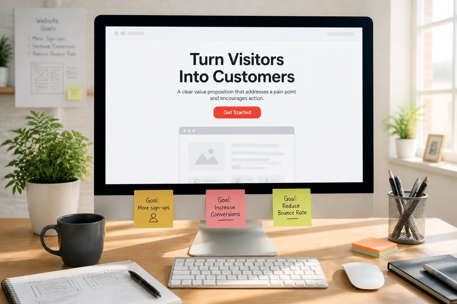
The defining constraint. One page, one action.
Pages with a “Start Free Trial” button, a “Book a Demo” button, a “Download the Guide” link, and a newsletter signup are not offering choice — they’re distributing attention across four outcomes and getting less of all of them.
What good looks like: a single primary CTA, repeated as the page gets longer, phrased identically each time. Not “Get Started” at the top and “Sign Up Now” at the bottom — the same words, so it reads as one action rather than several.
When to bend it: a secondary, visually quieter option is fine when there’s a genuine second path for a different readiness level — usually “buy now” versus “talk to someone first.” Keep it a text link, not a competing button.
2. The headline does most of the work
More visitors read the headline than anything else on the page, and a large share read only the headline before deciding.
What works: specificity. “Invoicing software for freelance designers” outperforms “Financial clarity, simplified” because it tells someone in two seconds whether this is for them.
What doesn’t: abstraction that could describe any company in the category. The test is whether a competitor could put their logo on your headline without it becoming false. If they could, it says nothing. That’s a copywriting problem before it’s a layout problem.
3. Match the message to the ad
The most consistently underrated pattern, and the cheapest fix available.
If your ad promises “50% off winter boots” and the landing page headline says “Welcome to Our Store,” you’ve broken the connection between what someone clicked and what they found. They don’t reason about it — they just leave, and you paid for the click.
What good looks like: the landing page headline echoes the ad’s language closely enough that arrival feels continuous. Different campaign, different page.
4. Above the fold does one job: continue
The purpose of the first screen isn’t to convert. It’s to make someone willing to keep scrolling.
What works: headline, one-line clarification, the primary CTA, and a single trust signal. That’s usually enough.
What doesn’t: a full sales pitch compressed into the first screen. Cramming reduces clarity, and clarity is what earns the scroll.
5. Structure as objection handling
The strongest landing pages read like a conversation where the page answers each hesitation in the order it arises.
A rough sequence that works for most offers:
- What is this and who is it for (headline area)
- Why should I care (the problem, briefly)
- How does it work (three or four steps, not a feature list)
- Why should I believe you (proof, results, credentials)
- What about my specific concern (FAQ)
- What do I do now (final CTA)
The point isn’t the exact order — it’s writing the page as a series of answers rather than a series of sections.
6. Proof placed where doubt occurs
Testimonials dumped in one block near the bottom are decoration. Proof placed immediately after a claim is persuasion.
What good looks like: a specific result under the relevant claim. “Setup takes under an hour” followed by a customer confirming exactly that.
What doesn’t: a wall of logos without context, or five-star quotes so generic they could be about anything.
7. Forms as short as the offer justifies
Every field costs conversions. The question is what each field earns.
What works: matching field count to commitment. An ebook needs an email. A demo request reasonably asks for company and role, because the sales conversation requires them.
What doesn’t: collecting information you won’t use before the first conversation. Phone number on a newsletter signup is pure friction.
A useful trade to consider: fewer fields means more leads of lower average quality; more fields means fewer, better-qualified leads. Neither is automatically right — it depends on whether your bottleneck is lead volume or sales-team time. If form drop-off is the leak, a conversion rate audit is the structured way to find it.
8. Remove navigation (usually)
Standard advice, and mostly correct: a landing page receiving paid traffic generally shouldn’t have a full site nav, because it’s an exit menu.
When to keep some: if the offer is high-consideration and expensive, people genuinely want to verify you’re a real company. A single link to the main site, or a footer with company details, can build enough trust to be worth the leak.
9. Design for the traffic source
A page receiving Meta ad traffic and a page receiving search traffic have different visitors.
Paid social: interruption traffic. People weren’t looking for you. Needs more context and more persuasion, and it’s overwhelmingly mobile.
Search: intent traffic. People were actively looking. Can be more direct and get to the offer faster.
Email to existing list: warm. Skip the introduction, they know who you are.
Same offer, genuinely different pages.
10. Speed as a design constraint
On a landing page this isn’t a technical footnote — it’s directly financial. You paid for every visitor. A heavy hero video or an oversized image loses a share of them before anything renders, and you paid for those too.
The cheapest conversion improvement available to most landing pages isn’t a design change. It’s making the existing one load faster — start with a website speed test.
Where landing pages usually go wrong
Treating it as a mini-website. Nav, multiple goals, breadth. All exploration features on a page that needs decision features.
Writing about yourself. “Founded in 2012, we’re a leading provider…” Nobody arriving from an ad cares yet.
Feature lists instead of outcomes. Features describe the product; outcomes describe the visitor’s situation after using it.
Fake urgency. Countdown timers that reset on refresh, “only 3 left” that’s always 3. It works on some people once and destroys trust with everyone who notices.
Stock photography. A stock image of a smiling team in a meeting adds page weight and zero persuasion.
Mobile as an afterthought. Most paid social traffic is mobile. If the page was designed on a desktop and checked on mobile, that’s backwards.
No thank-you page. The moment after conversion is when people are most receptive, and it’s usually a wasted screen. It’s also where conversion tracking lives.
How to actually judge a landing page
Not “does it look good.” Three questions:
- In five seconds, can I tell what this offers and who it’s for?
- Is there exactly one thing I’m being asked to do?
- Does each section answer a question I’d actually have at that point?
If you’re evaluating someone else’s page as inspiration, add a fourth: what traffic is this page built for? A page designed for warm email traffic will mislead you badly if you copy it for cold paid social.
The uncomfortable part
The best-looking landing pages are frequently not the best-performing ones, and you can’t tell which is which from outside.
Design galleries select for visual interest. Conversion selects for clarity, and clarity is often visually unremarkable — a plain page with a sharp headline, obvious CTA, and fast load routinely beats a beautifully art-directed one.
Which means: use inspiration for structure and craft, and validate against your own numbers rather than against how impressive a reference looked. The only landing page that matters is the one your traffic actually converts on.
The short version
- One page, one goal, one repeated CTA in identical wording
- Headline specificity beats headline polish — if a competitor could use it, it says nothing
- Match the page’s message to the ad that sent people there; different campaign, different page
- Structure the page as answers to objections in the order they arise
- Place proof directly after the claim it supports, not in a block at the bottom
- Form length is a trade between lead volume and lead quality — pick based on your actual bottleneck
- Design for the traffic source; paid social and search need different pages
- Load speed is a conversion lever, and on paid traffic it’s a direct financial one
- Attractive and high-converting are overlapping, not identical — validate against your own numbers
Need a landing page built around one goal and the traffic that will actually hit it? That’s our landing page design and landing page development work.
Plenox Studio
Design notes from Plenox Studio on craft, conversion, and redesigns that hold up after launch.