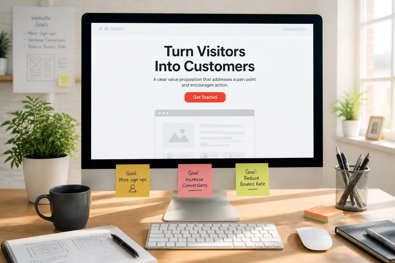
SaaS websites have a harder job than most, and it’s a specific one: convince someone to hand over their email and commit time to learning something, based entirely on a page they’ll scan for forty seconds.
That’s different from ecommerce, where the product is the thing you’re looking at. It’s different from a service business, where the site’s job is to get someone to make contact and a human takes over. A SaaS site has to explain an abstract product, establish that it’s credible enough to be worth the setup effort, and handle the objection that switching costs something — before anyone will start a trial.
Most SaaS sites fail at the first part and never get to the rest. When the product is the site experience, that’s often custom web application territory as much as marketing design.
The core problem: you’re selling something invisible
Nobody can see software from a marketing page. They can see screenshots of it, which is not the same thing, and which is why “beautiful product screenshot in a floating browser frame” has become the default hero image on approximately every SaaS site — and why it stopped working.
What a visitor actually needs to understand, fast:
- What this does — in their language, not your feature language
- Whether it’s for them — specifically, not “for teams of all sizes”
- What it replaces or changes — the before-and-after in their own workflow
- Whether it’s credible — is this a real company that’ll still exist next year
- What starting costs them — time, money, and how hard it is to reverse
Most SaaS homepages answer 1 vaguely, skip 2 entirely, and go straight to a feature list.
What actually works above the fold
Say what it does before saying what it’s for
The most common SaaS headline failure is abstraction: “Unlock your team’s potential.” “The operating system for modern work.” “Where great ideas become reality.”
These say nothing. Worse, they’re interchangeable — the same headline would fit a project tool, a CRM, or a document editor, which means the visitor learns nothing in the two seconds they spend reading it.
A headline that specifies what the software does, for whom, is worth more than one that sounds impressive. “Invoicing for freelance designers” beats “Financial clarity, simplified” every time, and it’s less fun to write, which is why it’s rarer. If the words aren’t doing that job yet, fix the website copy before polishing the layout.
Name the audience explicitly
Being specific about who it’s for feels like it loses the people it excludes. In practice it converts better, because the people who fit recognize themselves immediately, and the people who don’t were never going to convert anyway — they’d have started a trial, churned, and cost you support time.
“For agencies managing more than 10 clients” tells a matching visitor they’re in the right place faster than any amount of general benefit copy.
Show the product working, not the product sitting there
A static screenshot of an empty dashboard shows nothing. What converts is showing the product doing the thing — a short loop of the actual workflow, an interactive demo, or a screenshot annotated to show what’s happening.
The distinction is between “here’s what our interface looks like” and “here’s the problem being solved.” Only the second one is persuasive.
One primary action
Most SaaS heroes have a “Start Free Trial” button and a “Book a Demo” button and a “Watch Video” link and a “See Pricing” link, all competing.
Pick the primary path based on your product. Self-serve, low-price products should push trial. High-touch, expensive, or complex products should push demo — and offering a trial for a product that genuinely requires onboarding just produces churned trials and a bad conversion number.
The sections that do the persuading
Use-case pages, not just feature lists
Features describe the software. Use cases describe the visitor’s situation.
“Custom fields, automations, and API access” tells a buyer nothing about whether it solves their problem. “How agencies handle client approvals” tells them exactly whether it does.
If your product genuinely serves several distinct audiences, separate pages per use case usually outperform one homepage attempting to cover all of them — and they rank for what those audiences actually search. That’s closer to a landing page per audience than a single catch-all homepage.
Handle the switching objection directly
Most SaaS visitors already use something. The realistic competitor isn’t another tool, it’s their current spreadsheet plus the effort of change.
Sites that convert well address this explicitly: how long setup takes, whether data imports from wherever it currently lives, whether they can export it back out if it doesn’t work, and what happens to their existing process during transition.
The export question matters more than most SaaS companies want it to. Being visibly easy to leave makes people more willing to start — the fear isn’t trying it, it’s being stuck.
Pricing, visible
Hiding pricing behind “Contact us” is defensible for genuine enterprise sales and costly for everything else. For self-serve products, a visitor who can’t find pricing assumes it’s expensive and leaves.
If pricing is genuinely variable, publish a starting point and the factors that move it. Something is dramatically better than nothing.
Also: state what happens at the end of the trial. “No credit card required” is a meaningful conversion lever precisely because the alternative — hand over card details for a trial — is a real barrier. If you do require a card, saying clearly when they’ll be charged and how to cancel reduces the abandonment that ambiguity causes.
Social proof that’s specific
“Trusted by 10,000+ teams” is wallpaper. Nobody reads it.
What works is specificity: a named customer in the visitor’s industry, a described outcome, a logo they recognize as a peer rather than as a large company that’s obviously on a different plan.
For early-stage products with no impressive logos, specificity beats scale — one detailed account from a real customer doing recognizable work is more persuasive than a vague claim about thousands of users.
A real FAQ
SaaS FAQs are usually a dumping ground for questions nobody asked. Used properly, they’re where the actual objections go: what happens to my data, can I cancel anytime, does it integrate with the tool I already use, what if my team is smaller than your minimum, is there a discount for annual.
Every unanswered objection is a visitor who leaves to think about it and doesn’t come back.
The trial itself is part of the website
The conversion doesn’t finish at signup, and treating the site and the product as separate projects is why trial-to-paid numbers disappoint.
Time to first value is the metric that matters. How long between signing up and the moment they experience the thing they came for? Every step before that — mandatory profile setup, a team invite screen, a five-step wizard — is a place people abandon.
Empty states do real work. A new account with nothing in it is the most common trial-killing screen in software. A well-designed empty state shows what should go there and offers a fast way to get it — sample data, a template, an import. That’s UI/UX work inside the product, not just the marketing site.
Onboarding email is part of the funnel. Most trial users don’t return without a prompt. What arrives after signup often determines conversion more than the homepage that produced the signup.
What SaaS sites get wrong most often
Feature lists instead of outcomes. The most common single failure.
Buzzword abstraction. If the headline would work for a competitor in a different category, it’s not saying anything.
Fake dashboard screenshots. Mocked-up interfaces with invented data — the same instinct that produces generic stock photography, and equally transparent. Show the real product.
Too many CTAs. Every additional option reduces action on the primary one.
Hidden pricing on a self-serve product. Costs more signups than the qualification it buys.
Designing for investors rather than customers. A surprising number of SaaS homepages are optimized to impress people who fund the company rather than people who’d use it. Different audience, different page — the second one pays the bills.
No mobile consideration. People research on phones even when the product itself is desktop-only. The marketing site being unusable on mobile costs signups from people who’d have used it on a laptop later.
A useful test
Show your homepage to someone in your target audience who’s never seen it, for fifteen seconds, then take it away and ask:
- What does this do?
- Who is it for?
- What would you do next?
If they can’t answer all three, the problem isn’t the design polish — it’s that the page isn’t communicating. This test costs nothing and finds more conversion problems than most analytics setups. If you already have traffic and weak trial starts, a conversion rate audit or UX audit makes the same questions systematic.
The short version
- Say what the product does, specifically, before saying anything aspirational
- Name the audience explicitly — specificity converts better than broad appeal
- Show the product solving the problem, not a static screenshot of the interface
- One primary CTA; choose trial vs demo based on how self-serve the product genuinely is
- Build use-case pages rather than relying on a feature list
- Address switching costs directly, including how easy it is to leave
- Show pricing, and state clearly what happens when the trial ends
- Specific social proof beats large numbers, especially early on
- Time to first value inside the product matters as much as the homepage that produced the signup
Building a SaaS marketing site — or the product experience that has to convert after signup? Start with UI/UX design or contact us with your primary CTA already decided.
Plenox Studio
Design notes from Plenox Studio on craft, conversion, and redesigns that hold up after launch.