The gap that ruins most landing page projects isn’t visual. It’s structural — a design that looks perfect in Figma and turns into a fight the moment somebody has to build it.
The cause is almost always the same: Figma is freeform, so you can place anything anywhere, overlap elements, and ignore constraints — while the web requires proper structure, hierarchy, and responsive behavior.[1] Designs made without web constraints in mind look great in the file and become expensive in the build.
This is a workflow that closes that gap. It’s aimed at landing pages specifically, which have their own constraints — single page, one conversion goal, usually a fast turnaround, often heading straight into paid traffic where load speed matters. For the service side of that work, see landing page design.
Before you open a frame: set up the foundation
Skipping this feels faster and isn’t. Roughly twenty minutes here saves hours later.
Define your styles and variables first
Set up before designing anything:[1]
- Color styles — primary, secondary, accent, text colors, backgrounds
- Text styles — H1 through H6, body, captions, button text
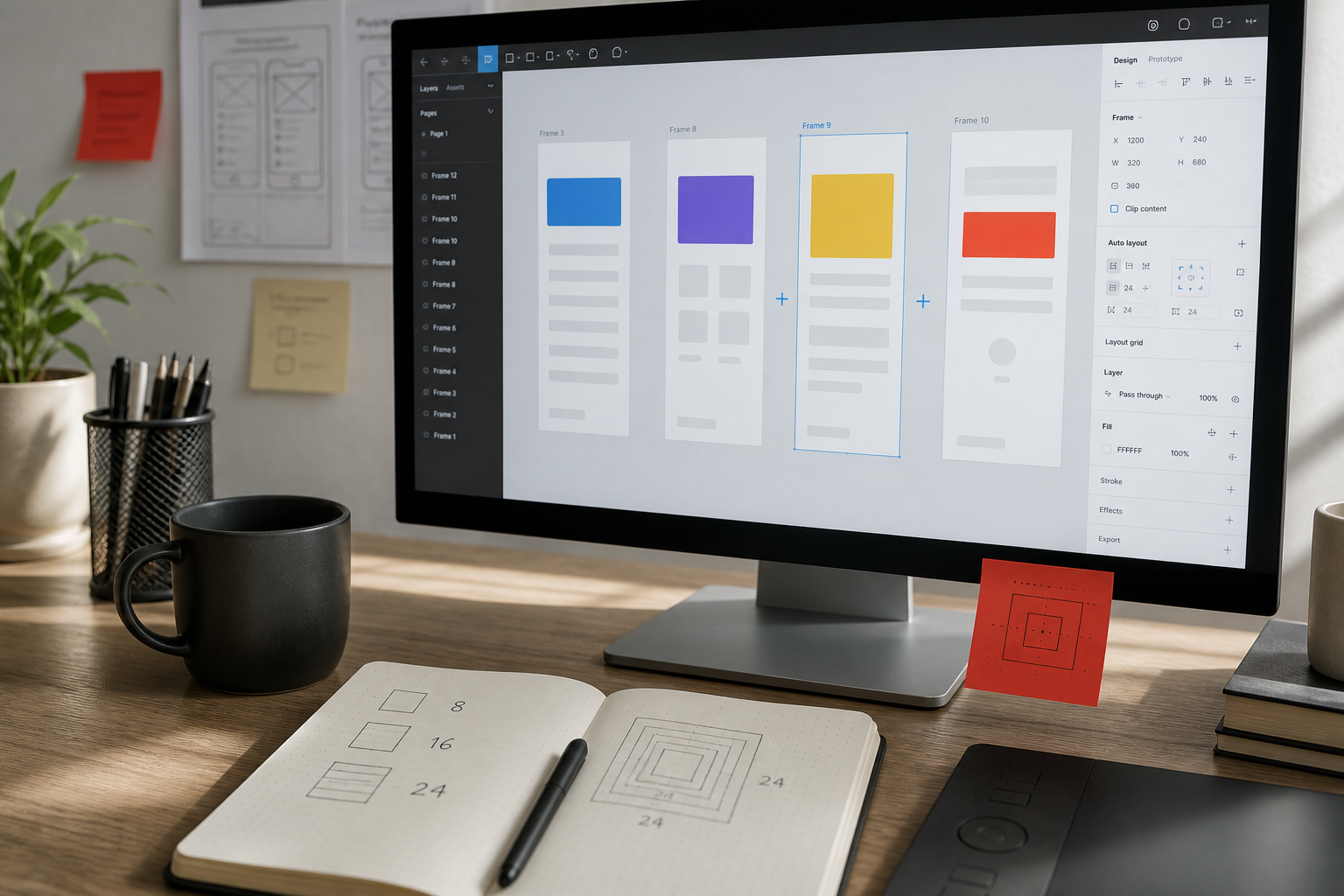
- A spacing scale — 4, 8, 16, 24, 32, 48px and so on
The spacing scale matters more than people expect. Arbitrary spacing values (13px here, 27px there) are the single biggest source of “the build doesn’t match the design” complaints, because a developer will round them to something sensible and you’ll notice the difference.
Use variables, not just styles
Variables let you bind spacing, color, and sizing to tokens rather than hard values. Full variable binding for spacing tokens is part of what turned auto layout from a convenience into core design system infrastructure.[2]
For a single landing page this can feel like overkill. It stops feeling that way the first time a client asks to change the accent color everywhere.
Set your frame widths deliberately
Common desktop artboard widths are 1440 or 1512. What matters more is deciding your breakpoints upfront — typically desktop, tablet (~768), and mobile (~375) — and designing at all three rather than designing desktop and hoping.
Auto Layout is not optional
If there’s one thing to take from this, it’s this section.
Auto Layout maps closely to CSS Flexbox: direction is flex-direction, spacing is gap, padding is padding, and Fill Container behaves like flex: 1.[3] When you use it correctly, translating design into code becomes close to mechanical. When you don’t, every element’s behavior has to be guessed at by whoever builds it.
The rule is blunt: if someone else is building it, everything should use Auto Layout, and absolute positioning should be rare — reserved for decorative elements or overlays.[1]
The consequences of skipping it are practical, not theoretical. A file built on Auto Layout resizes properly, hands off cleanly, and survives content changes without falling apart; skip it and every edit becomes manual repair work.[4]
The Auto Layout settings that matter most for landing pages
Hug vs. Fill vs. Fixed. Hug sizes to content, Fill expands to available space, Fixed stays put. Most landing page sections want Fill horizontally and Hug vertically — full width, height determined by content.
Wrap mode. Before wrap existed, a horizontal auto layout frame would simply overflow or shrink with no way to reflow children onto a second line.[2] For feature grids and logo rows, wrap is what lets three columns become one on mobile without building three separate versions.
Min and max width. These do a lot of work in making a design behave predictably between breakpoints rather than only at them.
Nest shallowly. Deeply nested auto layout frames become hard to edit and hard to translate. If you’re six levels deep, the structure is probably wrong.
Designing the landing page itself
Structural approach specific to landing pages, as distinct from multi-page sites.
Build in sections, as components
A landing page is a stack of full-width sections: hero, social proof, features, testimonials, FAQ, CTA. Build each as its own auto layout frame, full width, hugging vertically.
Make repeated elements components — buttons, feature cards, testimonial cards. Landing pages get iterated on heavily, and components mean changing a button style once rather than eleven times.
Design mobile early, not last
Most landing page traffic is mobile, particularly from paid social. Designing desktop-first and then squeezing it down is how you end up with a mobile version that technically works and converts poorly.
You don’t have to design mobile first, but design it early enough that mobile constraints inform the desktop layout rather than being retrofitted into it.
Watch content reflow, not just resizing
Testing responsive design isn’t about pretty pictures — it’s about content reflow, how elements shift position as the screen gets smaller. A three-column feature section on desktop should gracefully stack into a single column on mobile.[5]
Two practical checks while designing: keep tap targets at least 44×44px, since smaller ones are genuinely hard to hit, and set images to Fill with Scale constraints so they don’t stretch or squash.[5]
Use realistic content, always
Design with the actual headline length, the actual number of testimonials, the real product names. Lorem ipsum and perfectly-sized placeholder text hide exactly the problems that surface after launch — the headline that wraps to three lines, the testimonial twice as long as the others. If the words aren’t ready, that’s a copywriting problem to solve before polish, not after.
Design the states, not just the page
Buttons have hover and active states. Forms have focus, error, and success states. Sections have loading states if content is dynamic. If these aren’t in the file, someone else is inventing them — and inventing them inconsistently.
Handoff: where projects actually break
The days of sending a flat PDF to a developer are gone; in 2026 the tools are Dev Mode and Code Connect.[5]
Use Dev Mode
Dev Mode is a paid feature but valuable for handoff[1] — it gives developers measurements, spacing, and code-ready values without needing to interrogate the file or ask you.
Organize the file so it’s readable by someone else
Name layers meaningfully. “Frame 247” tells a developer nothing. Group sections logically and in page order. Delete abandoned explorations, or move them to a clearly-marked scratch page — nothing wastes a developer’s time like building from an outdated version left in the file.
Document what the design can’t show
Alongside the frames, write down:
- Which elements are links, and where they go
- Animation and transition intent
- What happens on form submit
- Any behavior that isn’t visible in a static frame
This is fifteen minutes of writing that saves several rounds of back-and-forth.
If building in Webflow
For teams going Figma → Webflow, the mapping is direct if you set up properly: an organized Figma design system maps to Webflow’s class system and variables, keeping updates consistent across both, and using rem for font sizes in Webflow makes typography responsive and accessible by default.[1]
If you’re heading into a custom frontend instead, the same Auto Layout discipline maps cleanly into frontend development — Flexbox and gap aren’t metaphors when the file was built that way.
Common mistakes worth naming
Designing at one viewport only. The design looks perfect at 1440 and nobody knows what should happen at 900.
Absolute positioning everywhere. Fast to draw, painful to build, breaks with any content change.
Arbitrary spacing. Every value should come from your scale.
Text as images. Hurts accessibility, hurts SEO, can’t be edited.
Ignoring load weight. A hero with a huge background video looks great in Figma and costs real conversions on mobile — particularly damaging on a landing page receiving paid traffic, where a slow load wastes money you already spent on the click. Check the trade with a website speed test before you ship the heavy version.
No empty or error states. Every form will be submitted wrong by someone.
Too many fonts and weights. Each additional weight is a separate file download.
A realistic sequence
- Set up color styles, text styles, spacing scale, and variables
- Define breakpoints and frame widths
- Wireframe the section stack — hero through CTA — before any visual design
- Design the desktop version using Auto Layout throughout, with real content
- Build repeated elements as components
- Design mobile, then tablet, checking content reflow rather than just scale
- Add states — hover, focus, error, success
- Clean the file: name layers, delete explorations, order sections
- Write the behavior notes Dev Mode can’t convey
- Hand off with Dev Mode enabled
Steps 8 and 9 are the ones most designers skip, and they’re the ones that determine whether the build matches the design.
The short version
- Set up styles, variables, and a spacing scale before designing anything
- Auto Layout on everything; absolute positioning only for decorative overlays
- Learn Hug/Fill/Fixed, wrap mode, and min/max width — they do most of the responsive work
- Design mobile early; check content reflow, not just proportional scaling
- Use real content, never placeholder text, and design all interactive states
- Clean and name the file before handoff, and document behavior that static frames can’t show
- Watch load weight while designing — on a paid-traffic landing page, a heavy hero costs money directly
Sources
- attabird — The Complete Figma to Webflow Workflow Guide (2026)
- David Šupík — Figma Auto Layout Mastery
- The Hangline — Figma Auto Layout for Web Design
- Analytics Insight — 10 Essential Figma Tips and Skills (2026)
- RJP Design — Figma Responsive Web Design Guide 2026
- Devōt — Figma Responsive Design Patterns
Figma ships features continuously — details verified August 2026, worth re-checking against current documentation before relying on any specific behavior.
Need a landing page designed and built so the Figma file and the live page actually match? That’s our landing page design and landing page development work.

Plenox Studio
Design notes from Plenox Studio on craft, conversion, and redesigns that hold up after launch.